Nationwide

Summary

Framing the problem

This is how we modernized a legacy insurance mobile app.

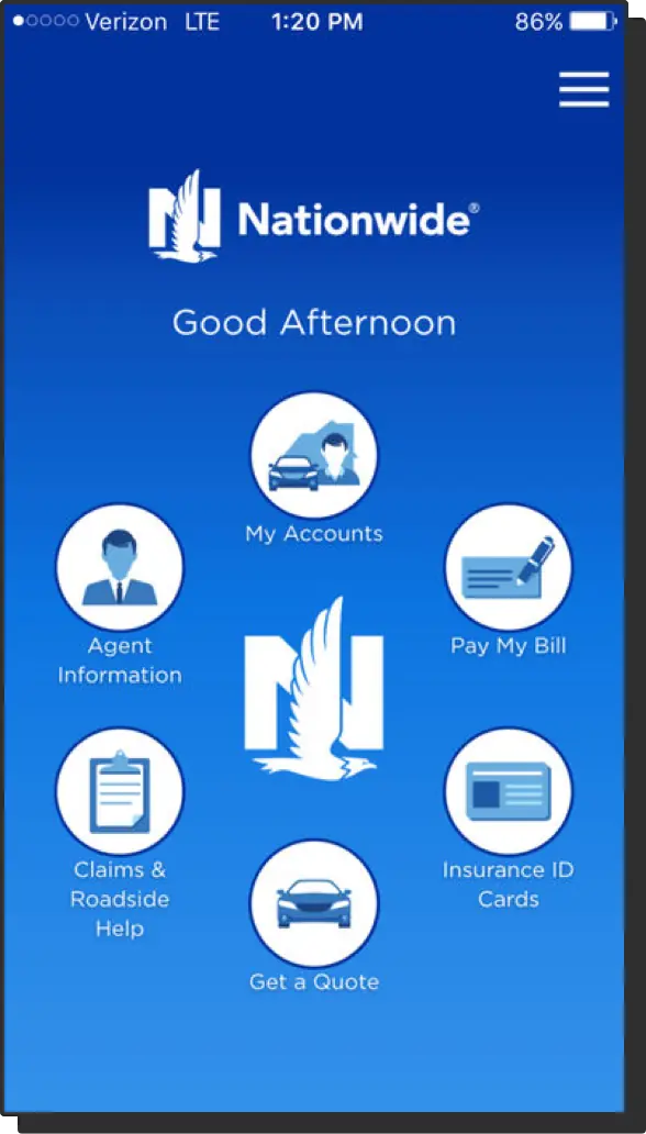
We started with an incredibly open ended blue sky app design. Similar to some of the other products I've worked on, this vision was more or less a final view of what the UX team thought the app should be.

My job was to build the foundational design system and work with the engineering teams to get us to that vision.

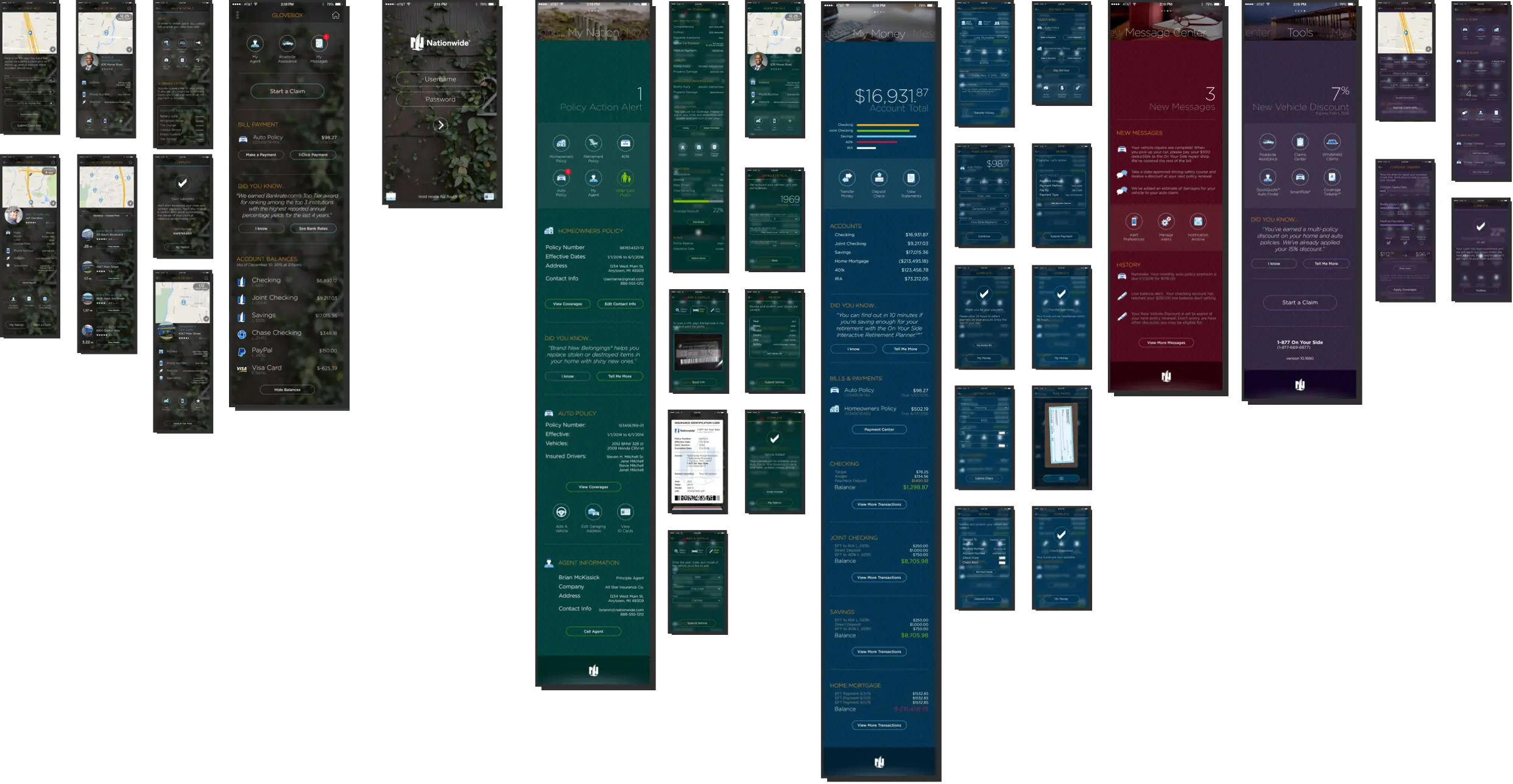
We started with an app built in the mid-2000's.

All of the information you might need was there but to do anything useful you'd have to dig two, three or four layers deep.

Screenshot of the original Nationwide mobile app showing cluttered navigation and dated visual design

Our Visual Designer created a new North Star.

North Star design vision showing modern, clean interface with card-based layout and improved navigation

Discovery

My job was to find patterns and work with 7 development teams.

I was in lockstep with our engineering teams, so much so that our design system became a library of shorthand symbols. This became essential near the end of the project. We were too busy and time was at a premium.

Design system documentation showing reusable components, spacing rules, and typography standards

I saved time by creating symbols and flows rather than screens.

Rather than creating distinct pages with placeholder data, I could have a conversation with the team and draw those symbols on a whiteboard. The engineers could start building the page and I could design it in parallel.

User flow diagrams using symbol-based notation to communicate design patterns quickly

Results

We built a great foundation for new, iterative work.