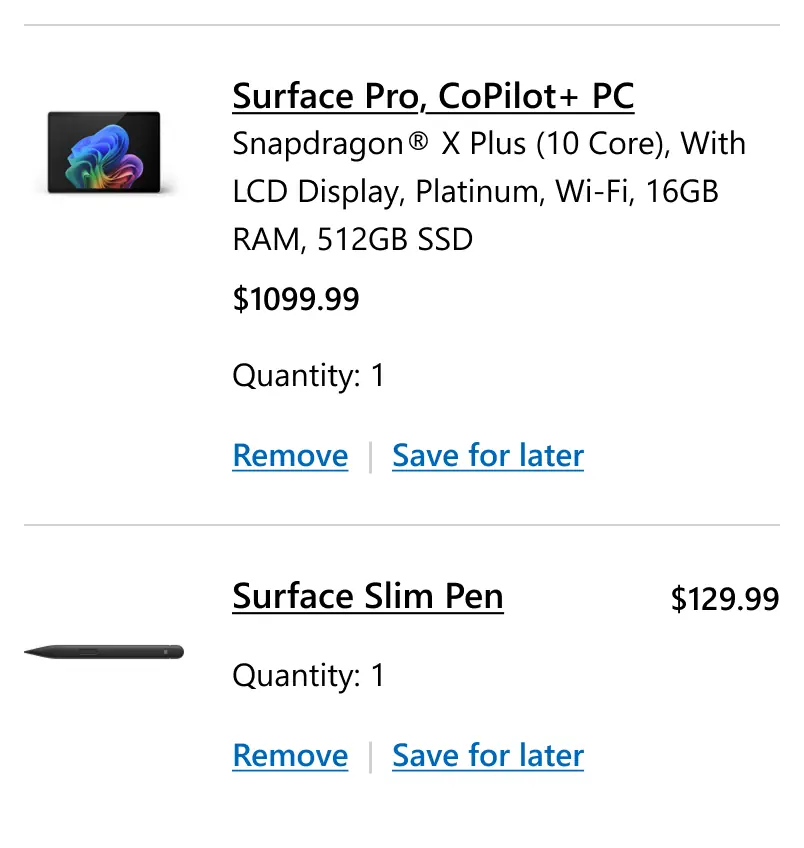
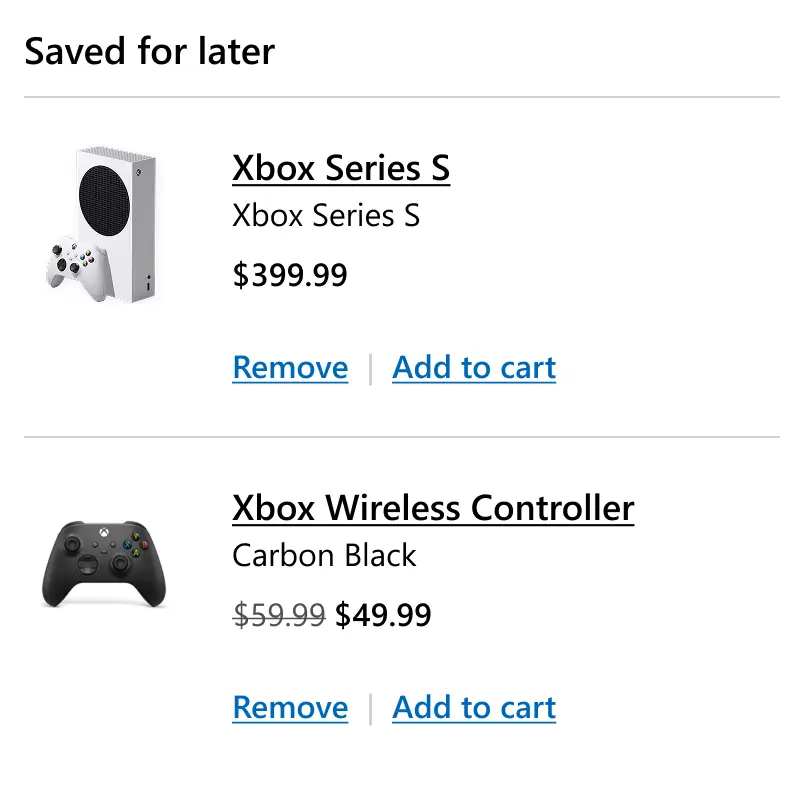
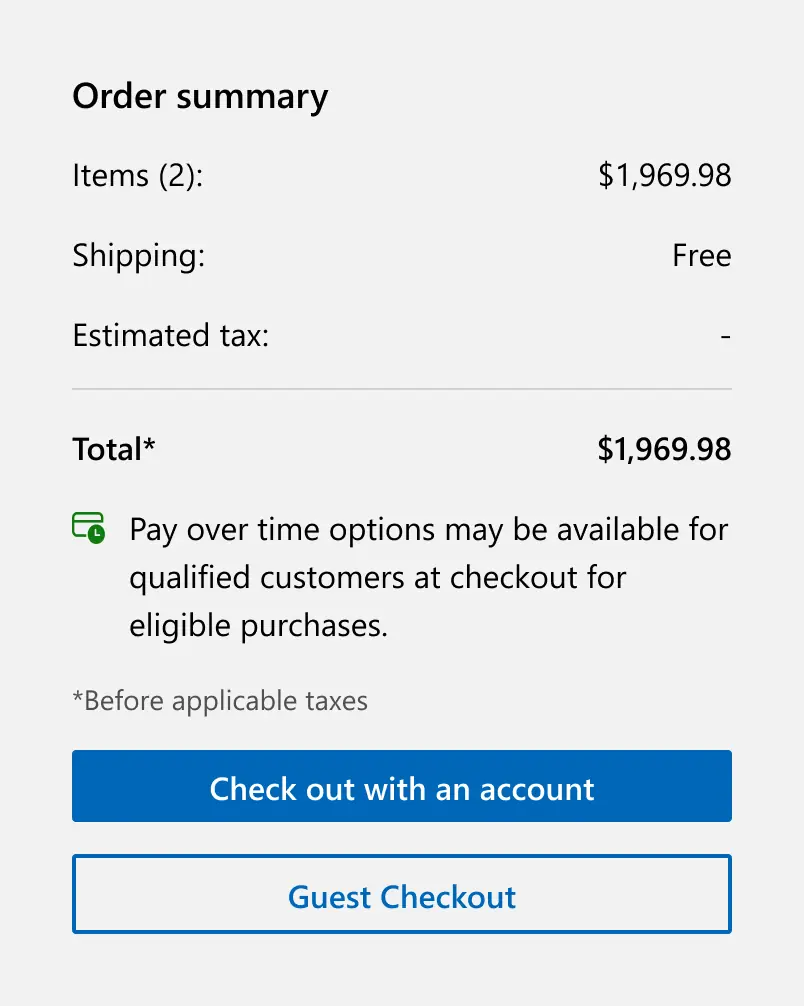
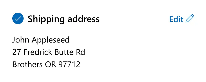
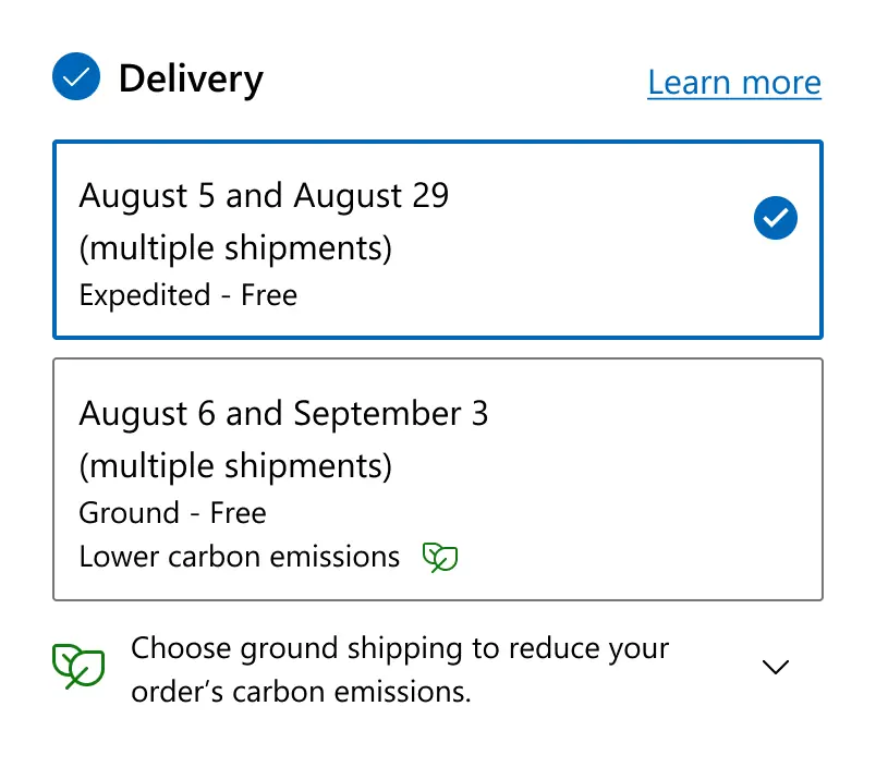
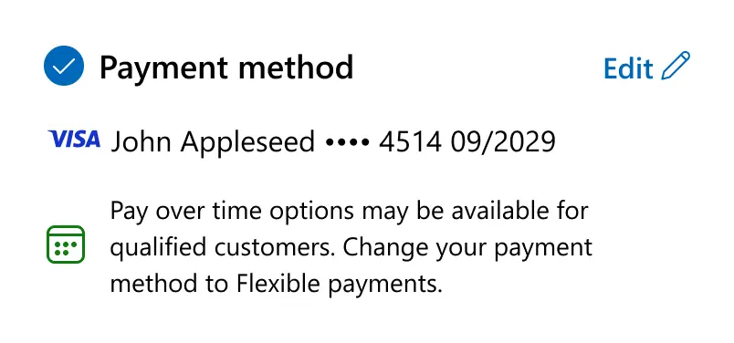
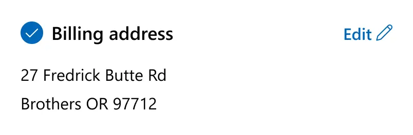
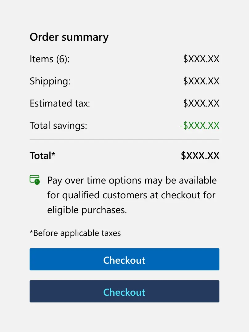
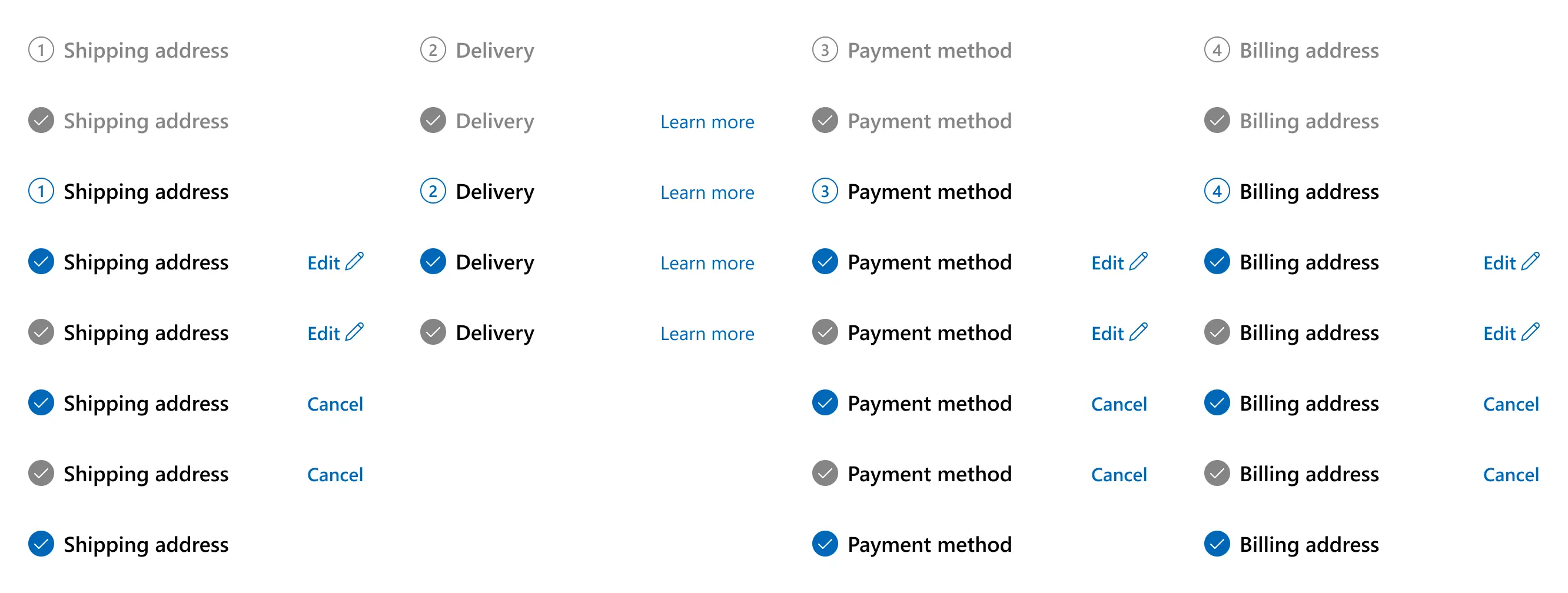
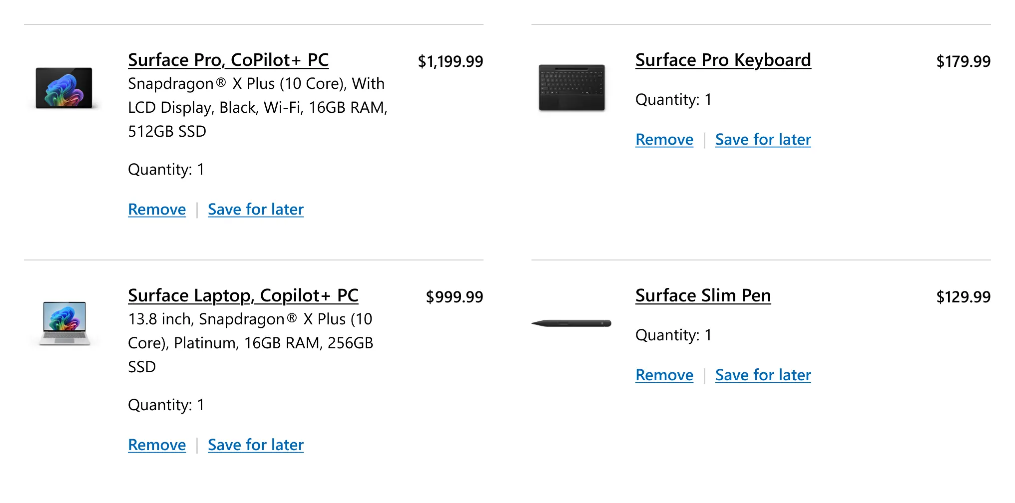
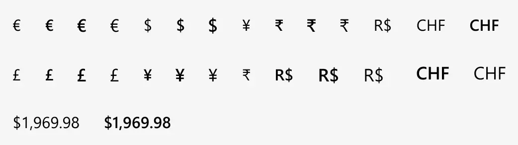
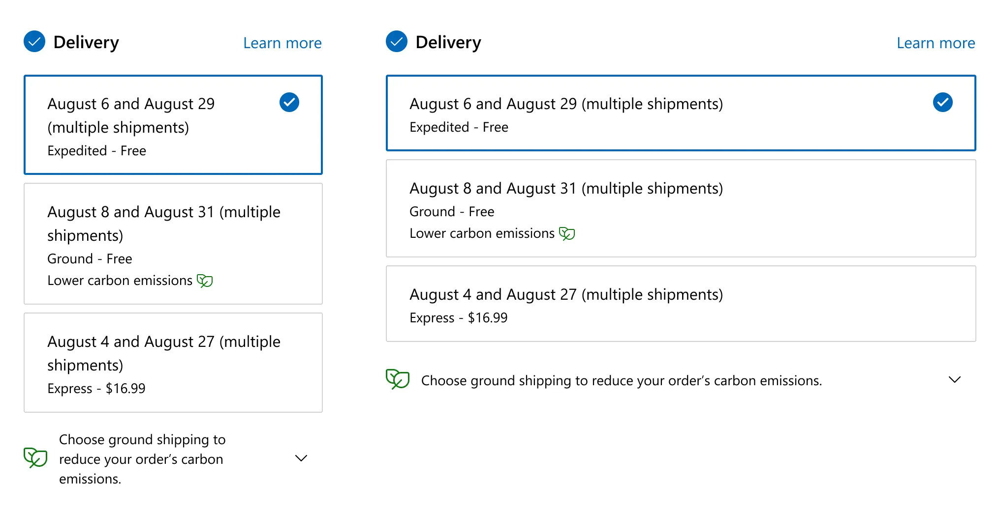
Microsoft's checkout serves customers in dozens of markets, each with different currencies, regulations, and product configurations. When I joined, the checkout team had screen templates that were wildly out of date. These screens didn't cover international scenarios, show real product information or display basic error states. The core design system was well organized but focused on marketing pages, not the transactional experience.
At the same time, design leadership was in constant flux. I worked under six different design leads in sixteen months. There was no established process to negotiate timelines for discovery, exploration, or usability testing. All of that needed to happen within pre-defined sprint schedules. Breaking a marketing page is frustrating. Breaking the payment flow leads to a direct loss in sales.